We build brands that mean business.

Contact

Channi Jakat Nama, T.P.13
Vadodara, Gujarat, India

4.8

2500+ reviews based on client feedback

Do Swad

Brand Story

DoSwad — Authentic Taste. Fresh Ingredients. Premium Experience.


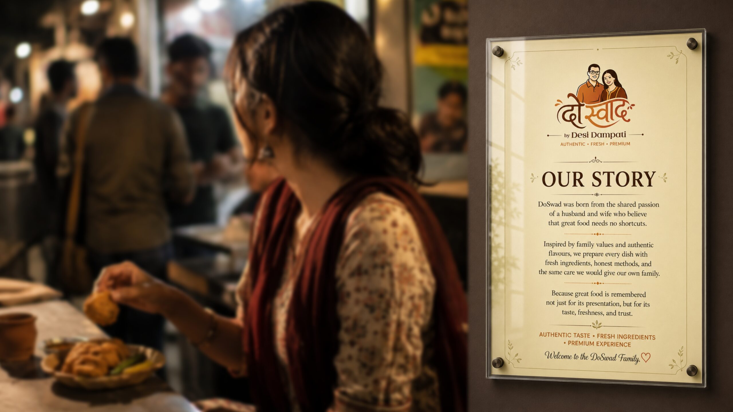
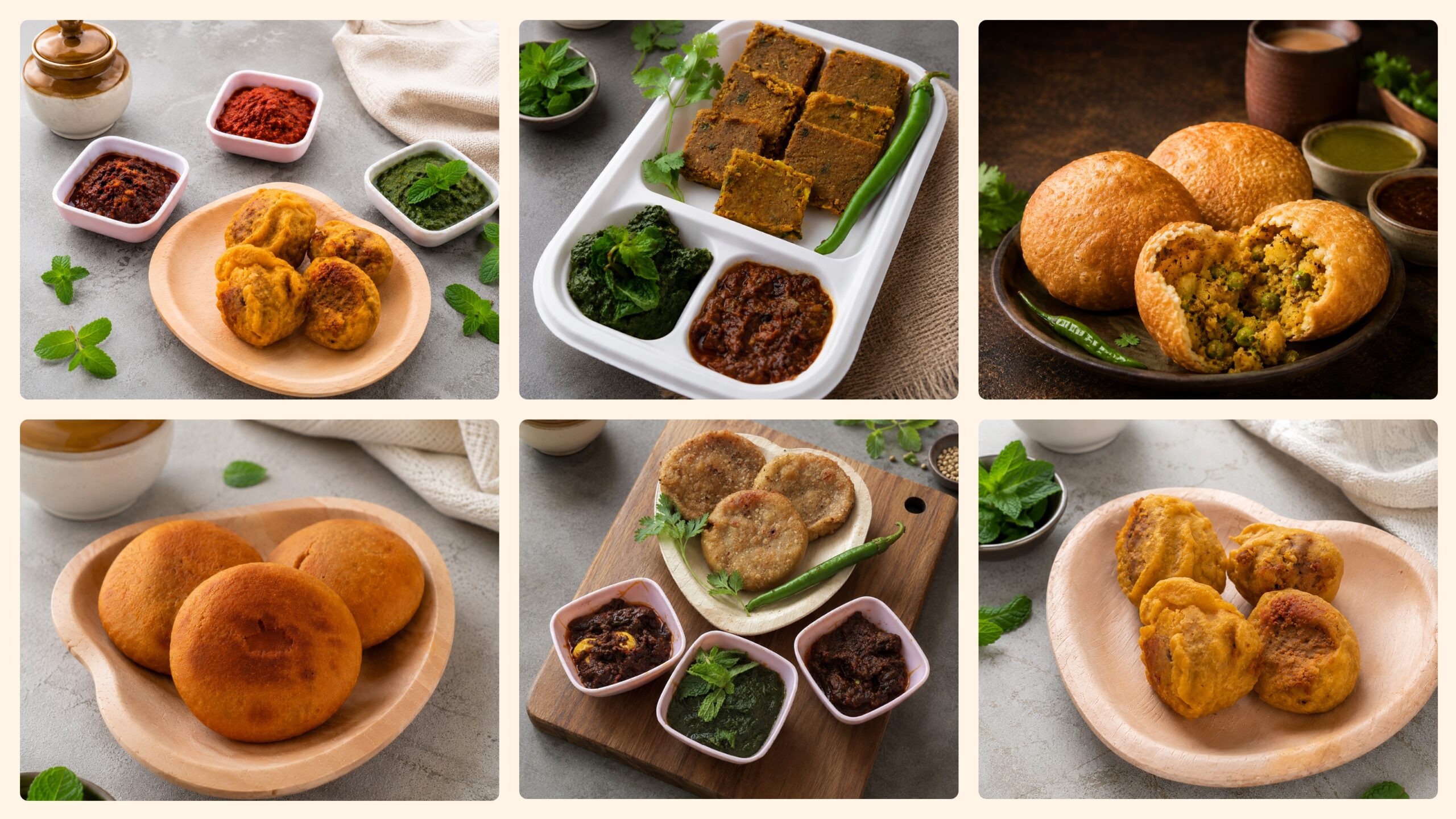
DoSwad was built around a simple belief: great food needs no shortcuts. Born from the shared passion of a husband and wife, the brand brings together family values, authentic flavours, fresh ingredients, and thoughtful preparation.


The identity needed to communicate more than just food. It needed to capture the warmth of family, trust of homemade care, and confidence of a premium food experience—creating a brand that feels authentic, welcoming, and memorable.

The Challenge

The challenge was to create a brand identity that could balance traditional food values with a contemporary, premium appearance.


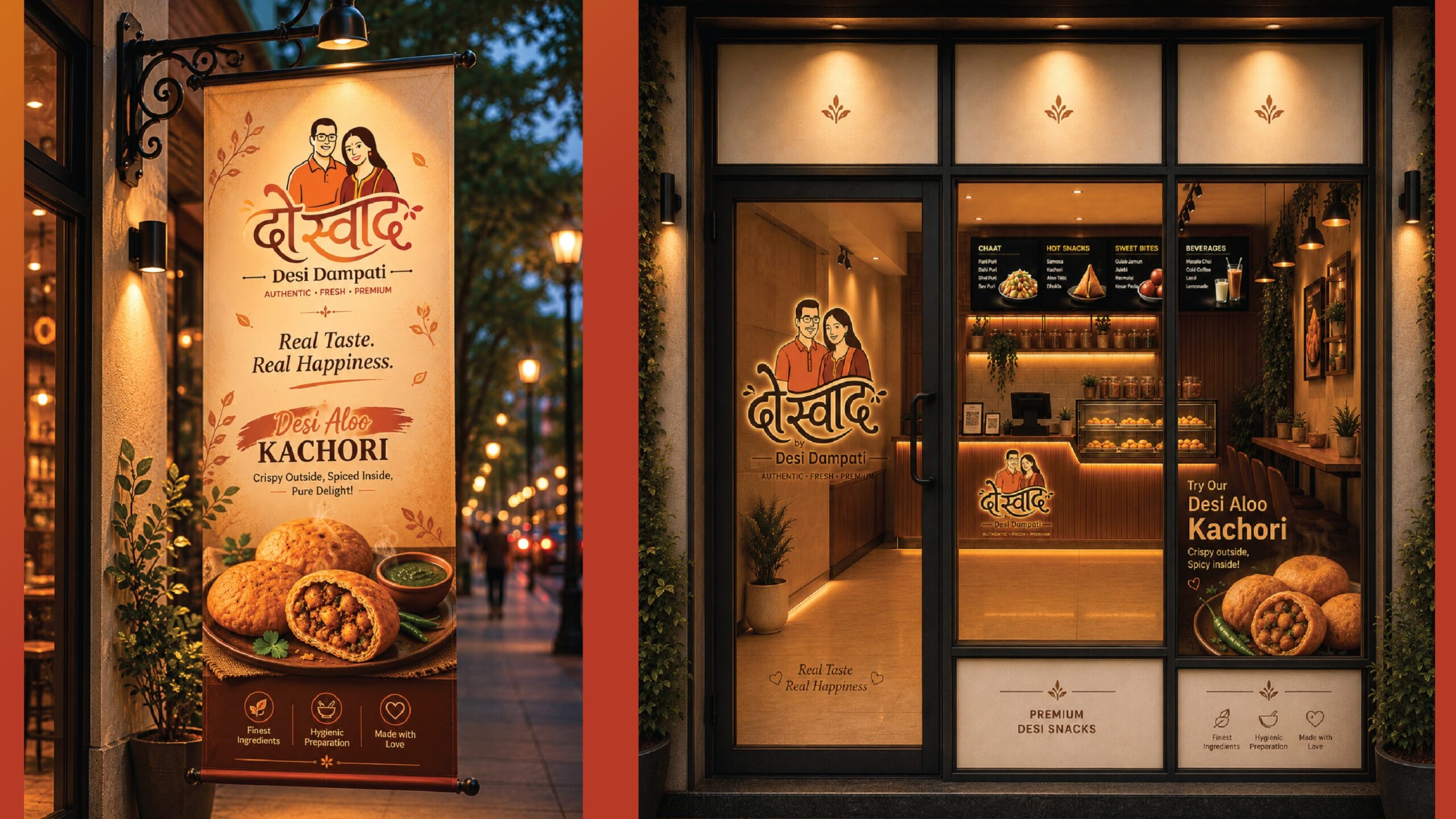
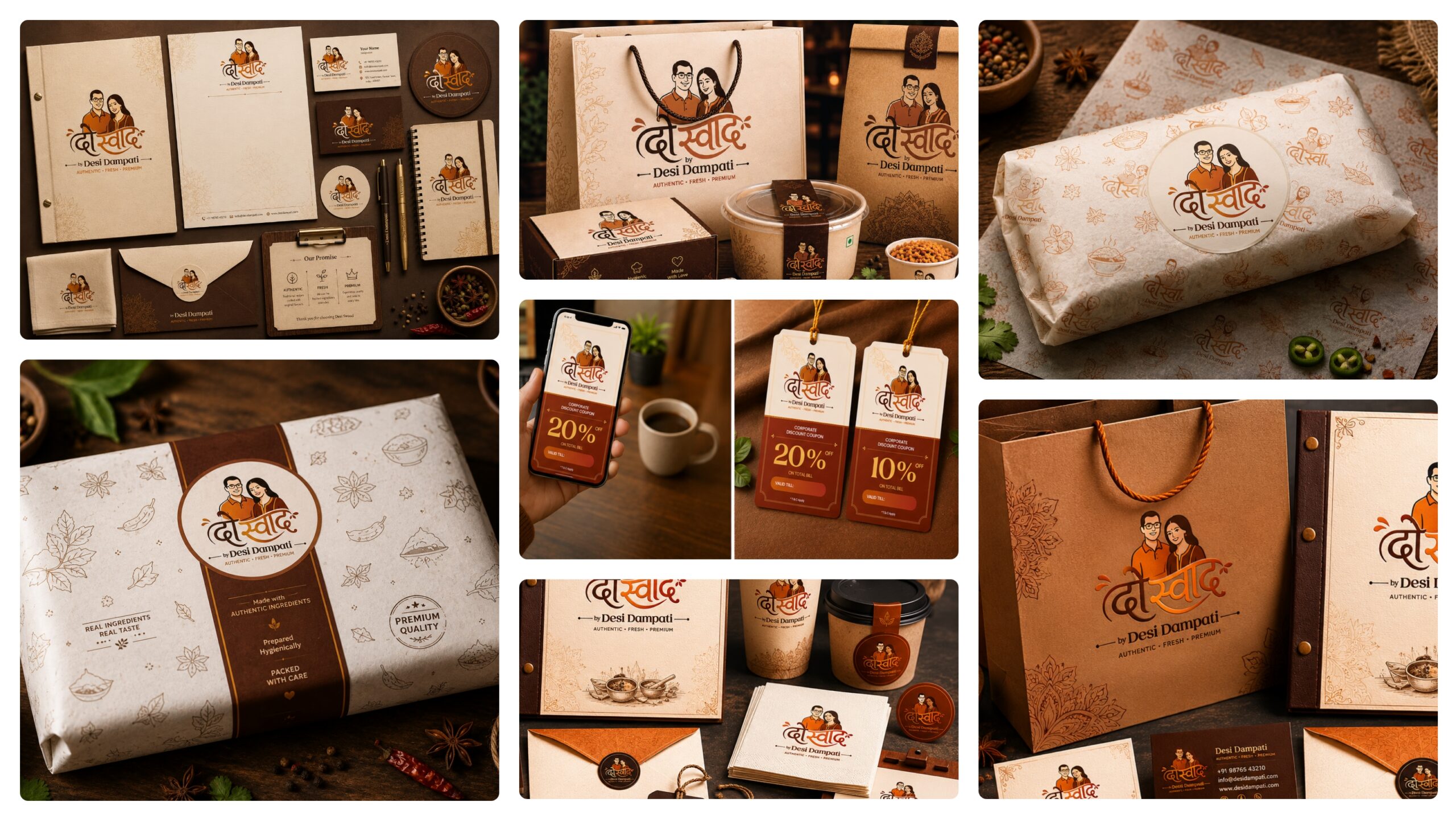
DoSwad needed a visual language that could work consistently across multiple touchpoints—from packaging and social media to brochures, franchise presentations, website, and physical brand spaces.


The goal was simple: make the brand feel as trustworthy as the food itself.

Our Approach

We built the identity around three core brand pillars:


Authentic Taste
Celebrating traditional flavours and honest food.


Fresh Ingredients
Communicating quality, freshness, and thoughtful preparation.


Premium Experience
Creating a polished visual presence without losing the warmth of the brand.


The design direction combined warmth, simplicity, appetite appeal, and contemporary refinement, creating a flexible identity system that could grow with the brand.

Logo Concept

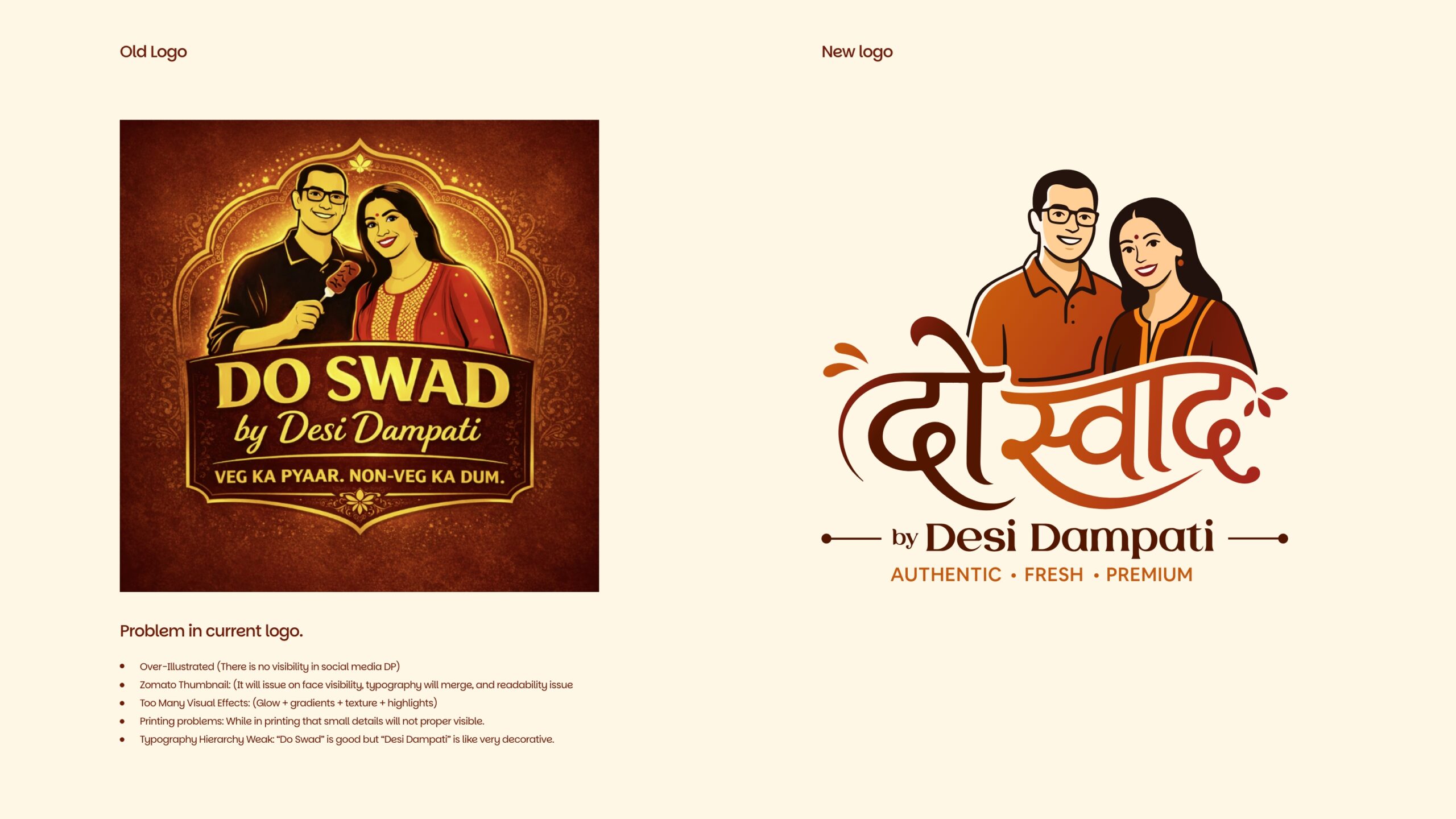
The DoSwad logo was developed to represent the brand’s central idea of two flavours coming together.


The concept draws inspiration from the brand’s name and its origin story—the shared journey of a husband and wife—creating a visual connection between “Do” and “Swad” (two tastes/flavours).


The resulting mark was designed to be simple, memorable, and highly adaptable, allowing it to perform equally well across packaging, signage, digital platforms, and printed communication.

Brand Identity

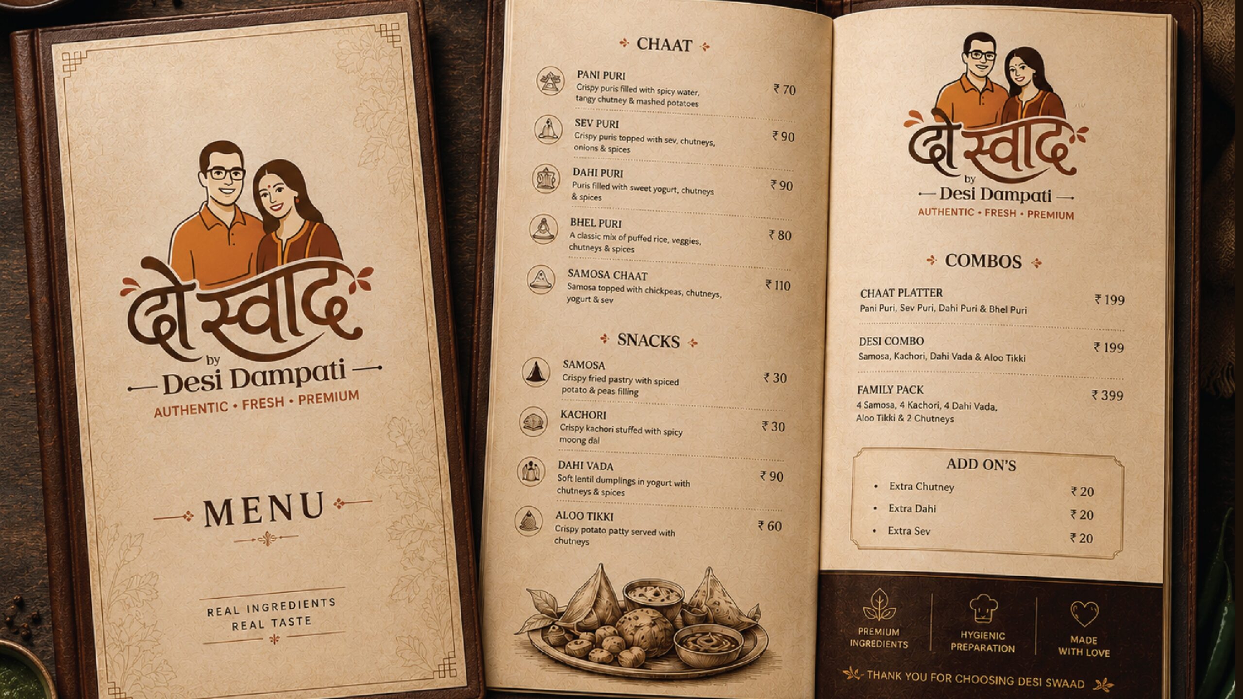
The visual identity extends the logo into a cohesive brand system built for real-world applications.


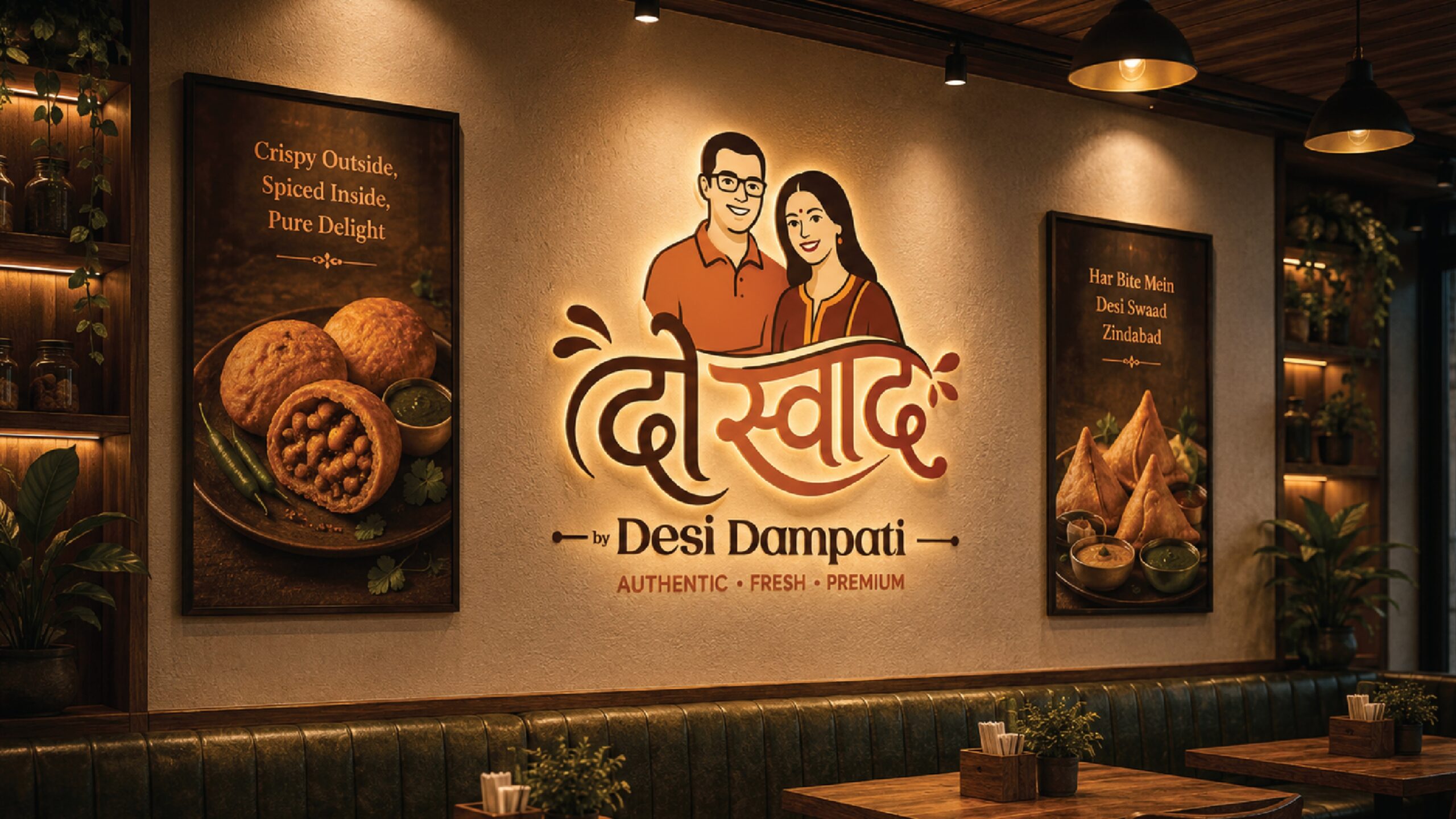
From packaging inserts and social media to website communication, brochures, franchise presentations, and wall branding, every touchpoint follows the same visual principles.


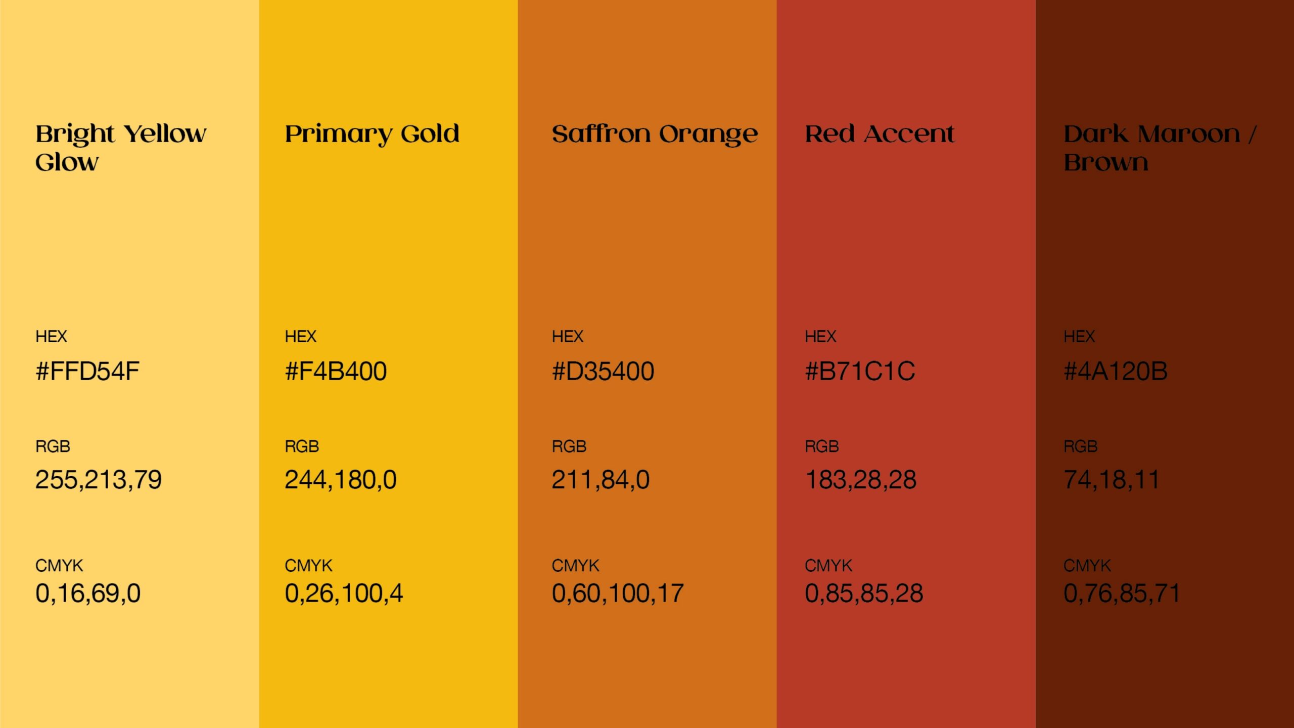
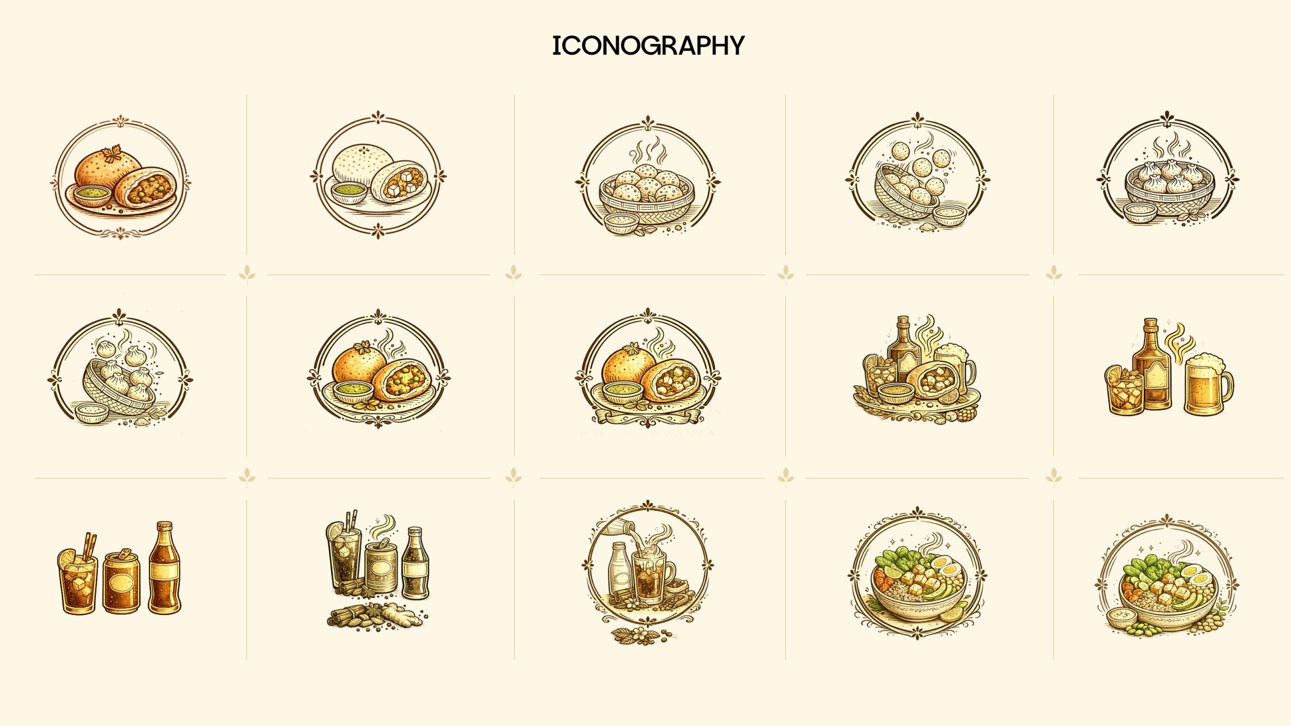
Typography, colour, graphic elements, imagery, and layout work together to create a personality that feels:


Warm • Authentic • Premium • Trustworthy


The system was intentionally designed to maintain consistency while giving each application enough flexibility to communicate naturally.


The Outcome

The result is a brand identity that moves DoSwad beyond being simply a food business and gives it a recognisable personality and visual presence.


The brand now has a flexible foundation that can be applied across customer-facing and business-facing touchpoints while consistently communicating its core promise:


Authentic Taste • Fresh Ingredients • Premium Experience


From the first visual impression to the final food experience, the identity is designed to make customers feel that they are welcoming DoSwad into their family.

Conclusion

DoSwad is ultimately a story about food, family, and trust.


Our role was to translate that story into a visual identity that feels contemporary without losing its roots. By combining authentic brand values with a refined and scalable design system, we created an identity built not only for today’s applications, but for DoSwad’s future growth.


DoSwad — Welcome to the Family.